I could have written about this work earlier, but I thought I might wait until the end…
In the late February, I submitted my work to the Student (years 1-6) category of the 32nd Dulux Colour Awards. Since the brief was simply the innovative use of colours and did not specify typology of the building, I thought ‘I can do it!’ – after completing the first year of the architecture bachelor degree, I didn’t have skills to design ‘buildings’ but I knew how to translate ideas into concept and then into the design of space.


After generating a number of concepts, I decided to focus on the relationship between sunlight and space explored through the symbolic meanings to colours, which ultimately suggests the flow of time. Here is the description I sent through:
This project aims to explore the new approach to represent the continuous flow of time through the use of colours in relation to the movement of the sun.
Humans have a strong tie with the sun; shadows formed by sunlight have been utilised to tell the approximate time of the day, and the sun is considered as the source of life. Every day, the sun’s rays move gradually from east to west at the same time the angle of the orbit of the sun in the sky changes as we understand solstices and equinoxes.
Colours represent atmospheric qualities, seasonal changes, the warmth and lightness of the air, especially when they are integrated with the juxtaposition of shapes, tonal variations and light and shadow. Therefore an individual’s sensory experience in the space is heavily influenced by colours.
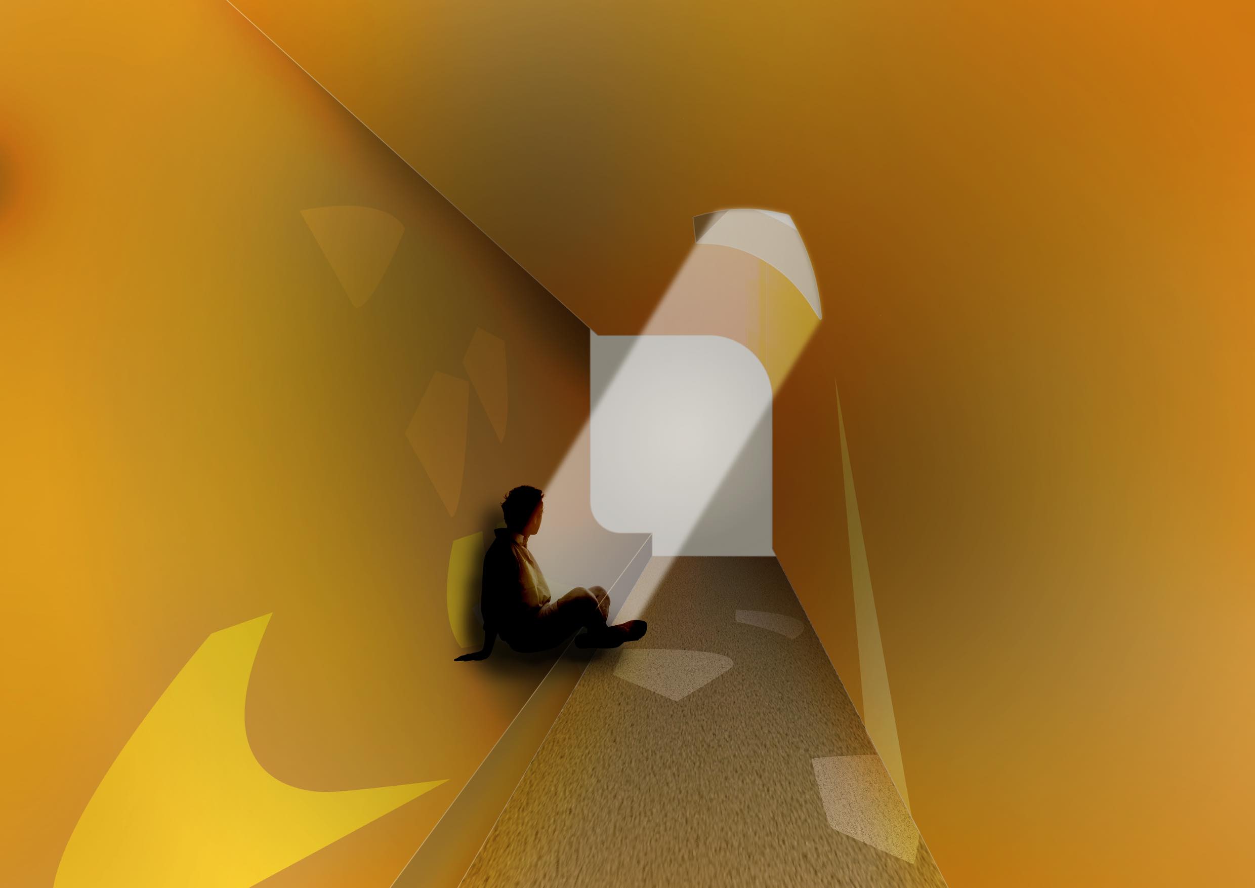
This space is characterised by the mapping of the shapes of sunlight entering through the single skylight at nine different times of a year: morning, daytime and afternoon on the summer solstice, winter solstice and spring/autumn equinox. Individuals are invited to sit or lie down on the elevated ground to spend time contemplating and observing the movement of sunlight.
The tonal variation of yellow-based Dulux paints is utilised, in order to depict the cohesiveness of space and to create a harmony with sunlight, the focal point. Each of four paints encompasses symbolic meanings: Capital Yellow as the base colour, encapsulating the sense of warmth of the sun; Tinker Light for the sun on the day of summer solstice, having the strongest contrast against the base colour to articulate the impression of the crisp outline of the summer sunlight; Golden Marguerite for the richness and the subtlety of the sun at winter solstice; and Happy for sun at spring and autumn equinox, forming the smooth transition between Tinker Light and Golden Marguerite, the summer and winter sun movement.
Whilst having direct symbolic relationships with sun movement, the use of colours is aimed to compose a minimal and subtle yet philosophical space where individuals can reflect on their presence in the flow of time.
In the late March, I received an email that my work had been shortlisted, which was a great delight. I was asked to send through the project board displaying the colour swatches and images. It was the first formal project board and so I took a lot of care printing, sticking and posting it.

And finally, on the 10th May (last Thursday), I attended the awards ceremony held at NGV International (the hall under the stained glass ceiling!). It was such a wonderful opportunity to see how architects make project boards for their works and to find out the winning works. I also had a short moment to talk with Warwick form Mihaly Slocombe Architects, who I knew from attending AND. Speakers series last year.

After attending the ceremony, I found that the use of colours can be informed by the relationship with the local context of the project (such as the Fitzroy Crossing Renal Hostel by Iredale Pedersen Hook Architects), the possibility of the multiplication of optical effects (for example, 5 Sam Sing Street by Collins and Turner Architects and Environa Studio), and the quality of the spatial experience (such as Percy St by Bagnoli Architects).

