
Through my brother, I was commissioned to create a large-scale artwork for the client’s new house. In spite of other commitments and study, I was very excited to take this opportunity and make an artwork for the client (it was the first time I was commissioned to make an artwork!). The request from the client was to incorporate the aspect of nature, especially of Dandenong Ranges, and to use bright colours as the artwork would be displayed on the wall opposite from the front door, where visitors would see when they enter the house. In the conversation, we talked about cherry blossoms in Dandenong Ranges, and so I decided to use cherry blossoms as the main motif of the artwork. We then measured the size of wall available and determined that the dimension of the work would be 1m x 1m.
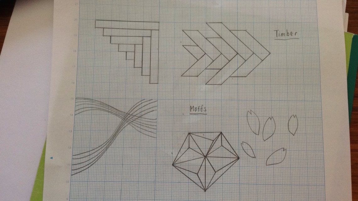 The brainstorm began with ideas of incorporating timber, warm colours (pink, orange, red), cherry blossoms, screen printing techniques and paper cutting techniques. Through the observation of objects surrounding me, such as a shoelace and a knitted piece, I came up with an idea of making a mosaic work using pieces of timber, representing the passage of time, from generation to generation. I explored different designs formed by pieces of timber and chose a design that suggests a sense of movement.
As it was the first time to use timber as the main medium in the production of an artwork, I sought technical advices from my art teacher at school, which was very helpful as he used to teach woodwork in different school. I acquired a better understanding of the selection of timber – what I needed was hardwood, kiln-dried dressed timber. He also gave me a suggestion of the board for the back of the artwork. As the artwork would weigh a lot, he recommended me to get masonite board as it would be strong enough to hold the work.
31 October: With my host father, I went to Bunnings to get a masonite board and two timber with different widths (same thickness), in order to create a rhythmic structure in the work.

3 November: I asked my host father to help me cut timber into pieces. In order to create a harmonious relationship between the vertical and horizontal outline of the artwork (square) and the main motif made of timber, I decided to cut timbers with the angle of 45 degrees and right angle. Each timber piece had one end with 45 degree angle and another end with the right angle. Length of each piece was not planned before hand because I was not sure how they would look like when they are configured. I started arranging pieces as I cut, so I could tell whether I want longer or shorter pieces, to have a balanced composition. After cutting out all pieces, I sanded the surface and corners of timber down to give a smooth and sharp texture to them. At this stage, I had an idea to varnish timber, however I decided not to do it as I found it difficult to tell the suitable kind of varnish, how it would look like and the time I could spend for doing it.
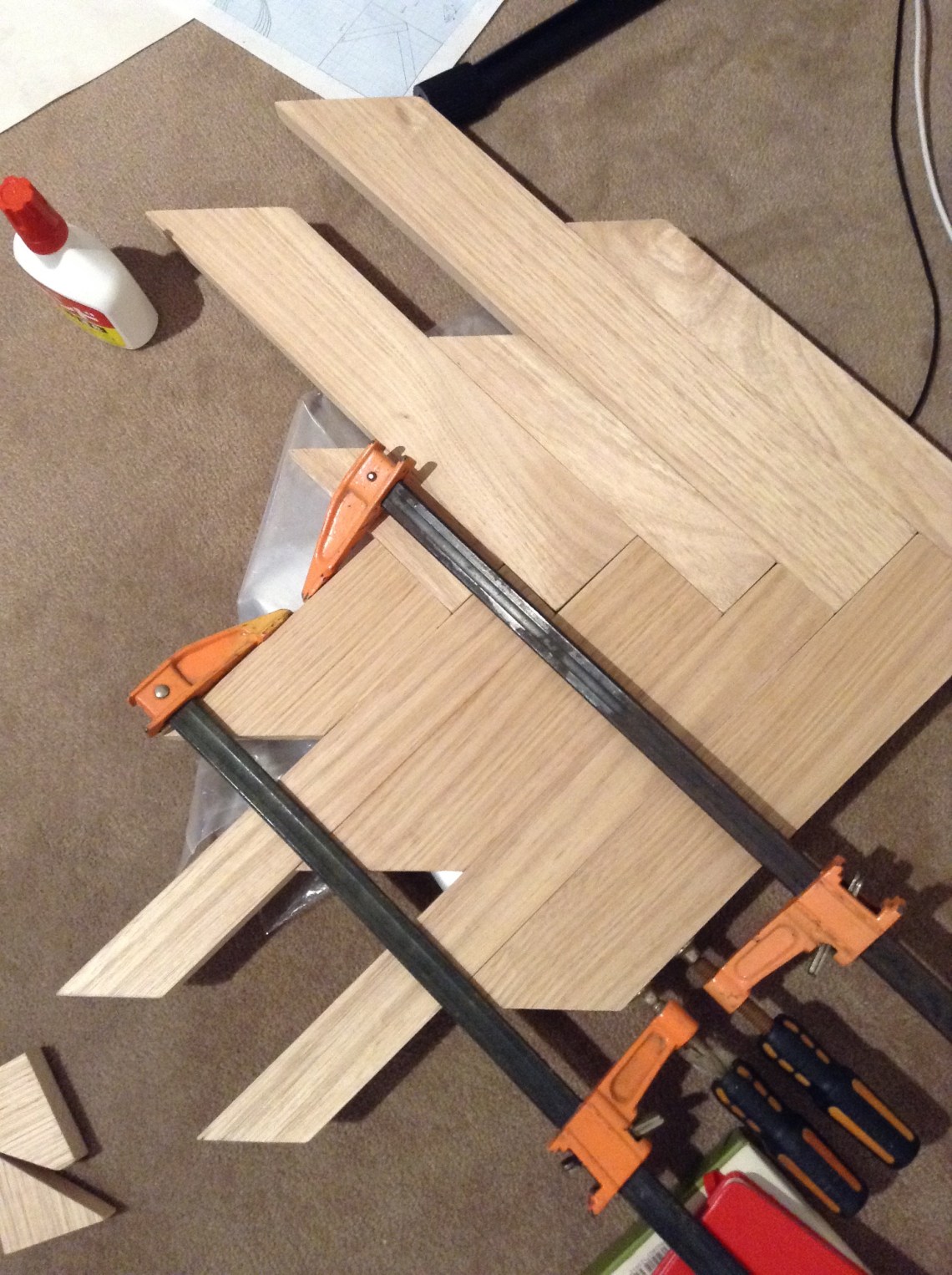
8 November: Using two clamps, I glued pieces of timber together. I utilised PVA glue as it is most suitable glue for the wood. I tried to make sure that timbers were flat, but later I found that the timber put together was slightly warped…. (which was later fixed)

13 November: During the exam season, I took the timber piece to the school so I could work on the screen printing process. When my art teacher saw the piece, he was concerned of the unevenness of the surface of it, caused by the different thickness of the timber pieces and the solidified PVA glue between pieces of wood. I was a bit sad and tired as I had to sand it before the screen printing process, and it was the only day I could do screen printing. The art teacher suggested me to ask the school maintenance to sand the piece. Fortunately, the maintenance staff member kindly undertook the sanding work for me, using medium and fine sand paper. The difference of surface quality between before and the after the sanding was very obvious and I was so glad that I decided to do it. It made the screen printing process a lot easier and allowed the screen ink to be printed evenly.
I made three stencils for the screen prints using acetate sheets. The acetate sheet is a clear plastic sheet that could be used multiple time for screen printing. For two stencil designs, I used Adobe illustrator to draw accurate straight / curved lines. All stencils were hand cut. For third stencil, I drew a series of random geometric shapes, varying in scale. This stencil formed a link between two contrasting stencil designs.
I utilised my favourite orange and white screen ink (in specific tub!) – having the appropriate thickness and brightness. From my experience of the screen printing process in Studio arts, I cared the angle of the squeegee, pressure and speed of the movement of the squeegee in order to have a crisp, successful outcome.
1st design: curved lines, printed with orange, located on the upper part
2nd design: “mountain” made of straight lines, printed with white ink, located on the lower part
3rd design: random geometric shapes, printed with the mixture of orange and white ink, located in between 1st and 2nd design.
14 November: Today I went to Bunnings to get another masonite board, as I found out that the masonite board I got on 31 October was not big enough. To create an artwork with dimension of 1m x 1m, I had to get the board, either of 915 x 1220mm or 1220 x 1830mm. I knew that I was reckless, but I decided to get the board by myself (I was sorry to ask host father to go to Bunnings again) and the only Bunnings store I could get on public transport was in Hawthorn (getting off and on at Glenferrie station). I chose 915 x 1220mm because I thought I wouldn’t be able to carry 1220 x 1830mm board… (also, with 915 x 1220mm board, I only need to cut once to make a square). Although the dimension of the artwork became 915 x 915mm, the client was happy so I was very relieved. As there was a train disruption from Blackburn to Ringwood on the day I bought it, I spent a longer and tougher time to bring it back to the home in Tecoma. I asked my host father to cut the board into a square.

17 November: With the help of host mother, I took the masonite board to school for the painting. I spent whole day painting three layers of gesso paint with drying steps and two sanding steps. The consistency of the thickness of the paint was important in order to cover the dull, brown colour of the masonite board. After the board is ready to be used as the base of artwork, I applied white and orange paint and the special modelling paste using a palette knife. My initial idea was to print the texture of leaves on the modelling paste, however, it didn’t work effectively so I decided to discard the idea.

After the decoration of masonite board was completed, I fixed the timber motif on the masonite board using screws, with the support of the host father. It gave the artwork a stability and secured the durability of the work.
Then I created several motifs using paper. With white cartridge paper, I cut out a group of cherry blossoms. I intentionally made the outline thicker than the other sections of the motif, so it could be lifted up by nails hammered into the timber. With a dyed and waxed cartridge paper, I cut out petals of cherry blossoms that were to be arranged like a stream. I also cut washi paper into angular pieces and placed on the left section of the timber and around the timber piece.

19 November: After all components are prepared, I hammered thin nails into timber piece, remaining 1-2cm above the surface of timber. Then I stuck motifs using PVA glue. For washi paper, I used the same PVA glue to stick them.

20 November: I cut out my name from the cartridge paper and stuck it on right bottom of the work.
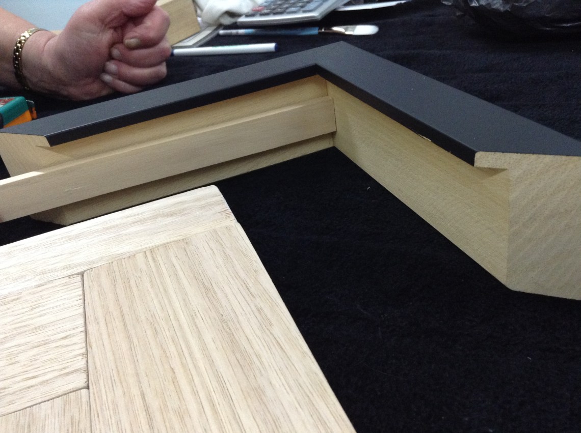
The framing step was not easy. The first framer I have visited to get a quote, was not experienced in framing heavy, large-scale three dimensional work and therefore the only choice they suggested me was to fix the frame directly onto the masonite board. They had only one black frame that could be used. I knew no other framer, so I was thinking that this is going to be the one I would be using. However, my design teacher, who helped me when I was painting the masonite board, gave me an advice that black frame would not suit the atmosphere of the work. He recommended that I should go to the different framer who he has used for his artworks.


So I visited that framer with my host mother, and we decided to have timber frame (light tone, similar colour as the colour of timber used for the main motif), cream coloured mount board for holding the Museum glass. I handled the artwork to the framer, and there was nothing else I could do.

27 November: I got a call from the framer on 26 November, that the artwork was ready to be picked up. So I visited the store with the client. The framing was done beautifully and I really loved the outcome.
Reflecting on the entire process of creating the artwork, I felt very grateful of several accidental occurrences that changed the direction of the artwork, such as the availability of equipments at school, the support of maintenance staff, art/design teachers and host family. I had faced many challenges, but they were all for the artwork. In fact, it was really a rewarding experience as I could learn many new things about mediums, materials and framing process. I would like to thank my host family, teachers and maintenance staff, and the framer. I hope the client enjoy having my artwork in her home!!


It is truly beautiful Saran. You will need to come and see it installed in my house when you return.
LikeLike
Thank you. Yes I would love to visit your house and see the work 🙂
LikeLike