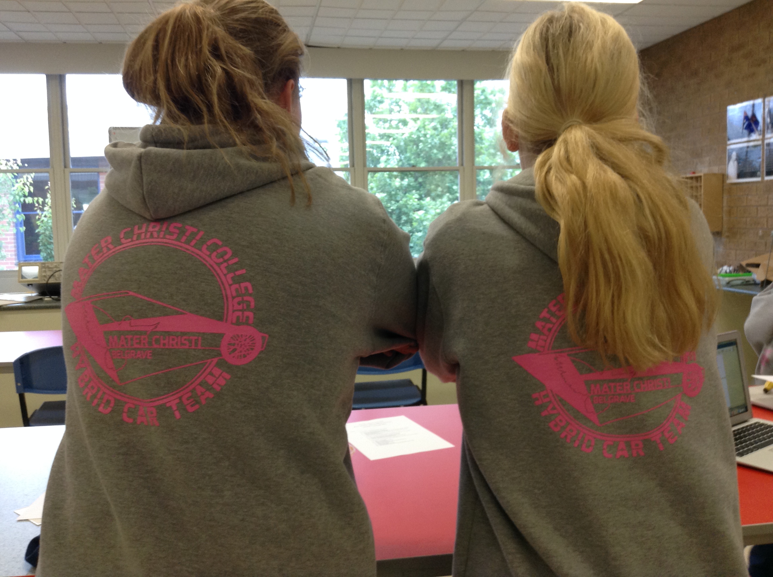
![]() This year I was very lucky to be able to work with the hybrid car team teacher to create new logo for the team. The generation of ideas begun with considering the current logo design, physical forms of their hybrid cars, and brainstorming the client’s need. I wanted to emphasise the speed and the movement of the car, so I decided to tilt the angle of the car, forming a sense of perspective to the design. In order to represent the distinctive identity of hybrid cars, I incorporated the linear outline of one of two hybrid cars. The contour of a dove is the symbol of the school, which can be found in the school logo. As an application, the final logo design was applied to the back of pink overalls with black ink.
This year I was very lucky to be able to work with the hybrid car team teacher to create new logo for the team. The generation of ideas begun with considering the current logo design, physical forms of their hybrid cars, and brainstorming the client’s need. I wanted to emphasise the speed and the movement of the car, so I decided to tilt the angle of the car, forming a sense of perspective to the design. In order to represent the distinctive identity of hybrid cars, I incorporated the linear outline of one of two hybrid cars. The contour of a dove is the symbol of the school, which can be found in the school logo. As an application, the final logo design was applied to the back of pink overalls with black ink.
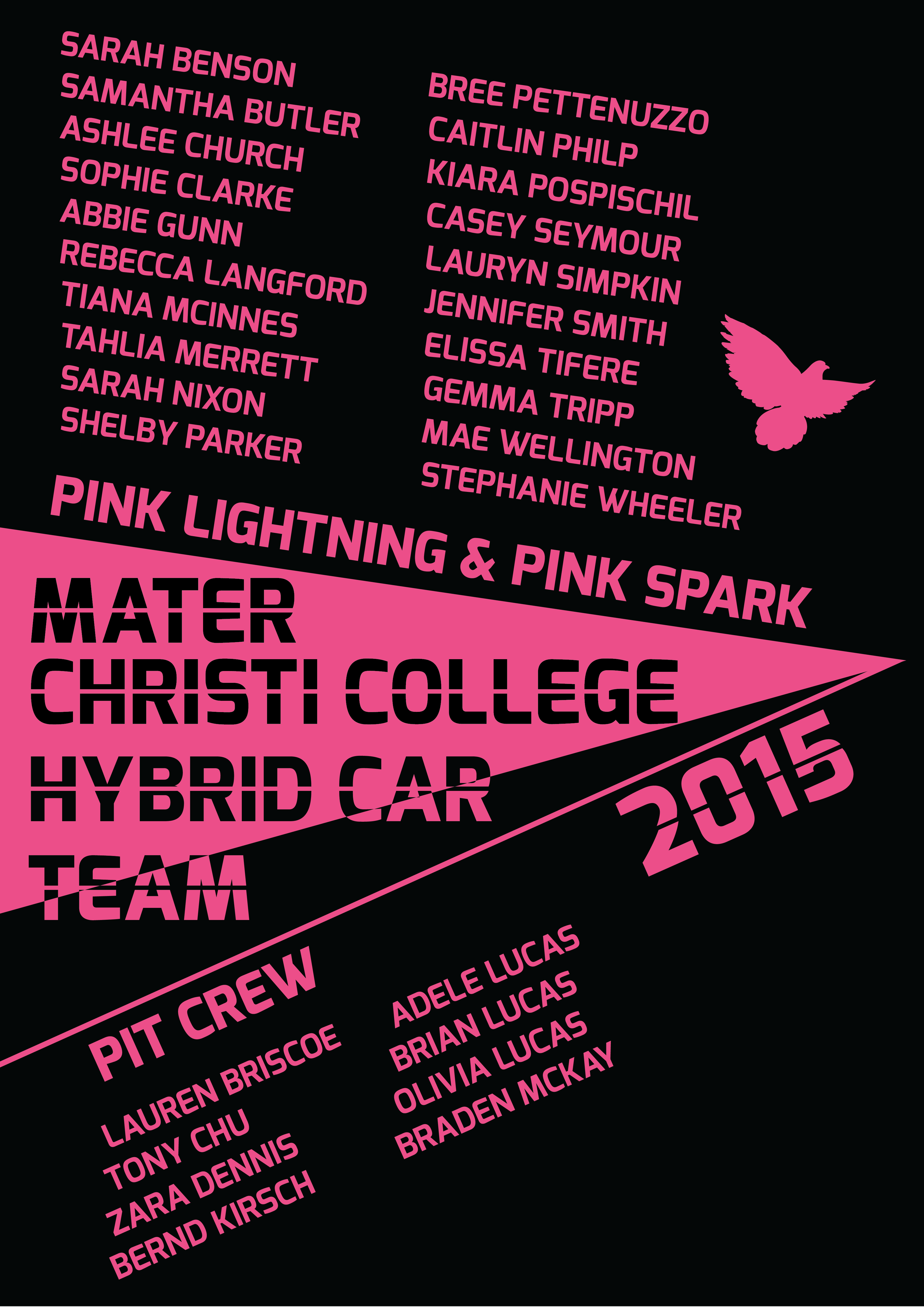
For hoodies, I acquired a list of team members and staff members to list them in the design. I thought sharp vertex created with straight lines would really depict the strong sense of the strength and the passion the hybrid team have, so I positioned it at the centre of the logo, where the focal point is made. The uniformity of the typeface utilised reinforces the unity of the team.
Today, the hoodies with this design were printed and given to team members… It was nice to see people wearing my design and that they liked it 🙂


