Escher x Nendo Exhibition held at NGV had been the one that I was longing to go and see since it was announced. M. C. Escher and Nendo are two of my favourite artists/designers, and the qualities of optical illusions and the conceptual intricacy behind the simplistic selection of mediums have influenced my perspectives on art/design (and love of geometry!) since I was in the primary school.
This article is about how I appreciate Escher’s works shown the exhibition, so I hope it gives you a fresh viewpoint on his artworks.
(As I started writing it got quite long, so I’ve divided the article into two – this is part one: Escher. The second part is about Nendo!)
The initial thought I had when I saw Escher’s works in the exhibition was ‘oh these are not drawings on paper but prints!’. I guess it’s the best part of seeing the actual artworks rather than images on books or the internet, that you can genuinely see the fine details of how the work was produced. I always thought his artworks are ink drawings on paper, but in fact, many of them are woodcut (design cut in a block of wood), lithograph (oil-based ink printing from a drawing on a waxed surface that is chemically etched), or mezzotint (engraving a partially roughened copper/steel plate).
The observation of his prints led me to ponder on Escher’s printing techniques to the extent of knowing the line weights, visual effects and three-dimensional qualities of the outcome, during the production. In the exhibition, I could see some of the pencil drawings and the sketches Escher completed before the printmaking process which demonstrated his ability to carefully observe and depict the subject matters in realistic representation.

I imagined him drawing what he sees onto papers, and then translating it in the language of printmaking; for example, his depiction of the sky in the landscape prints utilises various techniques – some woodcuts have grid-like cuts with thinner gridlines for darker area and thicker gridlines for lighter area, while some lithographs have blurred tonal variations fading into the horizon. He had even used multiple ink tones for the broader range of the visual effects.
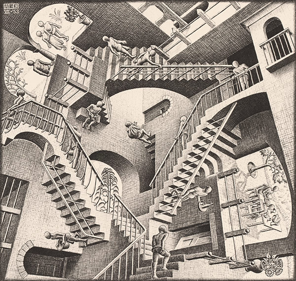
The exceptional ability to portray the true-to-life subject matter with the sense of the ambience that Escher developed in the early years enabled the successful and clear communication of his magical illusional world in the years to follow. For example, when we see Relativity (1953), we can recognise how he creates a sense of depth in the multi-dimensional world by the hatching with different densities and tones, in various directions. Even in depicting the imaginary space, he knows which part the light would illuminate and where the shade may be present. It looks easy, but it cannot be achieved without the meticulous observation of the behaviour of light and shadow and years of practice…!
As a maths and geometry lover, I enjoyed his exploration of the tessellations, metamorphosis and the infinity of the structure. In the exhibition, there was a series of drawings showing the process of coming up with repeated patterns and enclosing them in a grid, which helped me understand how he drew tessellation.

One of my favourite tessellation works is Day and night (1938) because of the elegant and peaceful representation of the mirrored landscape merged with the tessellation of the birds that melt into the rectangular fields. The birds in the front of the flights (ones on the left & right end) have the strongest contrast against the landscape, implying the sense of distance and depth while the birds in the transition from the fields provide flatness and smooth, harmonious tones. The complexity of the spatial qualities comes from the duality of the two-dimensional (tessellation) and three-dimensional (perspective) compositions.
The exhibition showed me the importance of the accurate observation and the drawing skills to visually capture what you see, as they become the stepping stones to the next level which is the experimentation and the exploration of the world that you want to convey to viewers.
The next article is about Nendo’s exhibition design!


1 Comment