Last week I visited National Gallery of Victoria International to see Andy Warhol Ai Wei Wei exhibition. It had been one of very exciting and significant exhibitions at NGV, and I was eager to go since last year (I wanted to go near the end of the period so there would be less number of people). In VCE Studio Arts and Vis Comm last year, I had studied about Pop Art and social, political and environmental aspects of these two artists’ practice so being able to see their artworks in the gallery was such a great treat for me. My art teacher had used their artworks to discuss legal issues involved – copyright, moral rights of artist, etc., so the exhibition reminded me of what I studied last year.
The exhibition consisted of a wide range of artworks from paintings, drawings, sculptures, installations, photography, multimedia works and printings. When I entered NGV, the large installation Forever Bycycles (2015) welcomed me.
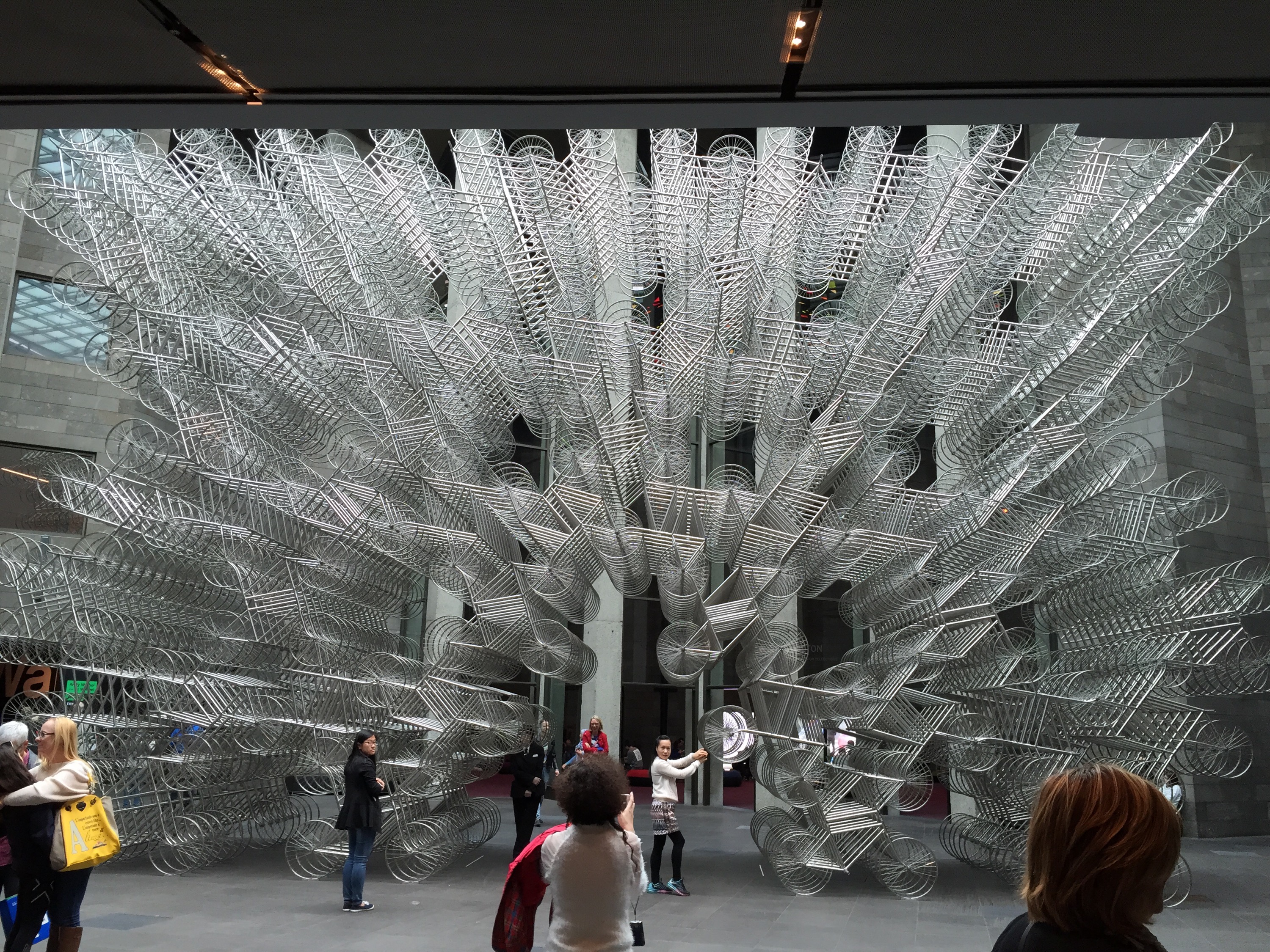 The simplified form of a bicycle has been multiplied and has become something more than just a bicycle. The use of stainless steel enhanced the reflection of the sunlight, which gave a depth and the endlessness to the work. The configuration of the bicycles almost looks like embracing the air, while there is nothing physical like wall that actually contains it. Each layer of the bicycles (if the work is sliced vertically) has created a pattern-like formation that keeps forming hexagonal empty space as you can see in the picture above. This structure resembles a beehive… at the same time the idea of strength may be discussed, the artwork highlights the relationship between the existence of individual bicycles and the momentum of the assembled bicycles as a whole.
The exhibition was structured with themes: Icons & iconoclasm, New York / Beijing, The studio: Factory & FAKE, Duchamp & the readymade, Flowers, Life on film, Celebrity & social media, Cultural revolutions, The individual & the state, and Narrative, myth & memory. Two artists’ artworks were displayed according to the classification of themes and subject matters.
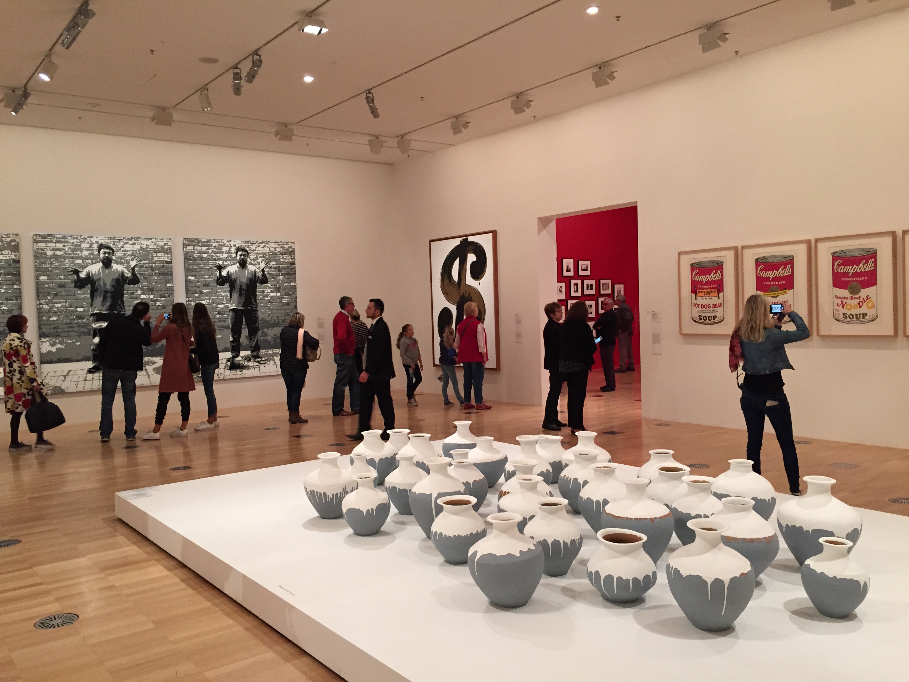
 The famous Marilyn Monroe screen prints were presented as a series in a small scale – Three Marilyns (1962). While there are various colour combinations for the prints of Monroe, this tinted colour scheme was interesting as the mixture of reality and the fantasy was well balanced. The allocation of bright pink on the section of Monroe’s skin whimsically creates a disharmony with light yellow for Monroe’s blonde hair. This makes the audience see this series of prints a kind of satire or humour, rather than a portrait.
 Ai Wei Wei’s triptych Dropping a Han Dynasty Urn (2015) was created with children’s plastic blocks from pixelated photographs. The action of dropping an urn is captured in three images each showing before, during and after – on the hand, in the air, and on the ground, smashed. The use of plastic blocks made me think of the urn scattering into small particles, going back to its original form of soil and the smallest individual pieces like blocks. Although the grayscale incorporated was from the original black and white photographs, its effect of tightening the impression given from the images encourages the audience to focus on the moment of the urn falling, like you are witnessing it in that fast moment.
 This photograph struck me hard. A woman on a chair in a room, with a another small wooden chair on the right edge. The picture is divided into two – black and white, the wall and the floor – but are connected by the presence of the woman whose skin and dress disturbs the complete distinction. There is also a unique contrast of two different chairs, facing opposing direction, by their materials, textures and the lines that outline their form. In this sense of tension and the attempt to form the perfect symmetry or composition, the lazy posture of the woman gives a hint of humour and the imperfection of the life.
 This detailed drawing done during Ai Wei Wei’s youth portrays the sense of fragility in the town at the same time it depicts the environment where the traditional Asian culture lives. The intricate composition of the figures positions the audience to feel the density of residential area and the tangled relationship between people and a community. There is no human figures and no ground drawn in the illustration, and that makes the atmosphere of it peaceful for a moment – it might be before everyone gets up and start their day -, the world is occupied with the silence and the full of the nature.
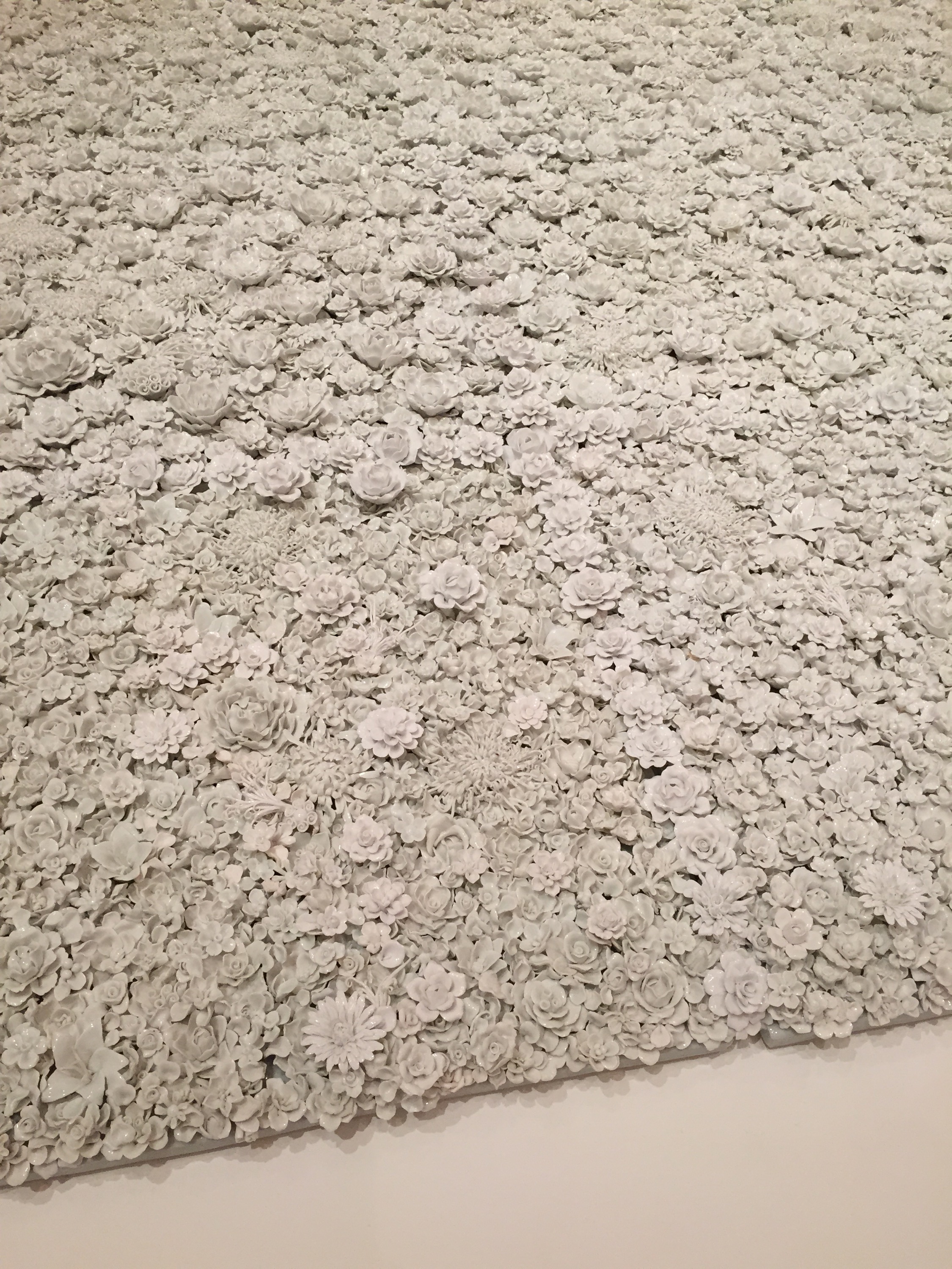 Blossom (2015) is an installation created with white porcelain. The garden bed full of flowers varying in scale, forms and species maintains the aspect of colour: white. This artwork was created in response to the Flowers for Freedom movement, reminding the audience of a significant number of people in the past and present who are struggling or struggled to acquire the freedom of speech or human rights. Utilising the art form of porcelain may be representing the resilience in the fragility of human being, symbolised as flowers. The complexity of the artwork made me wonder how it was made, and feel so overwhelmed by the time and effort put into the production.
I really enjoyed seeing both artists’ artworks and discussing about the symbolism, messages and the purpose of creating them with my friend. It was one of the best exhibition I ever went 🙂

